Order
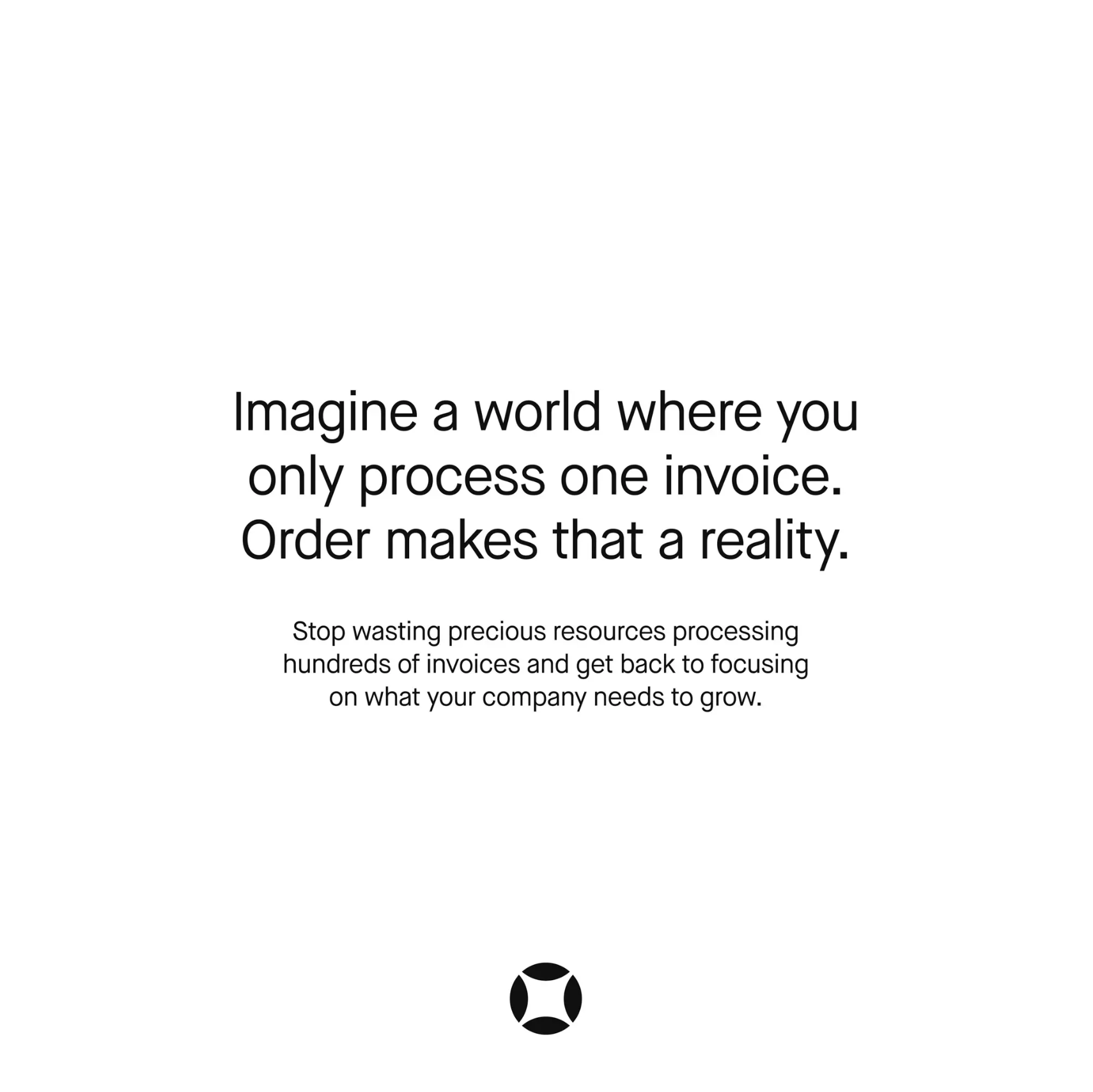
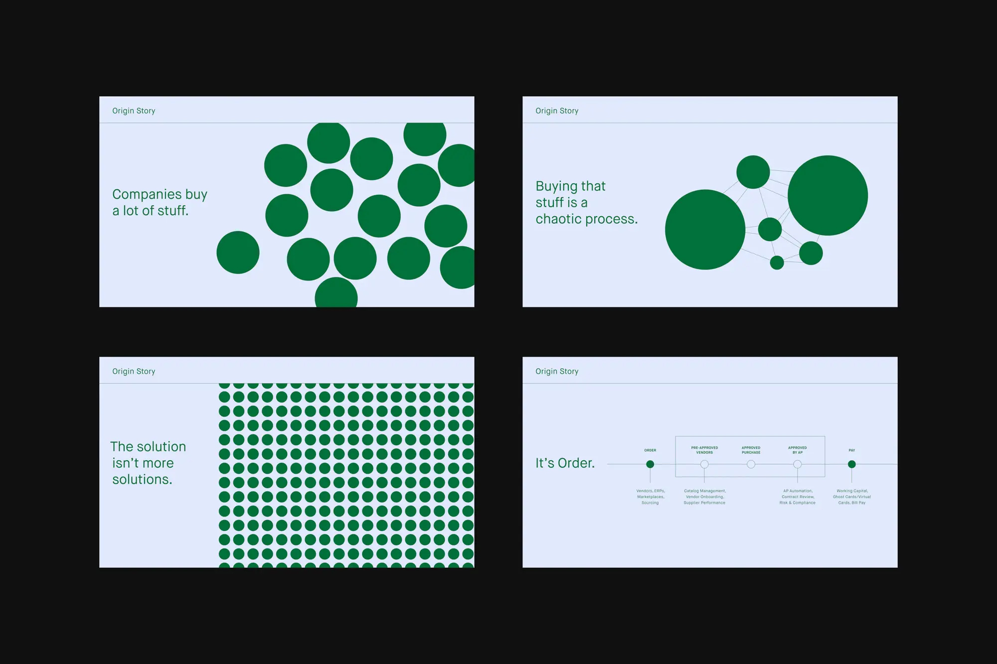
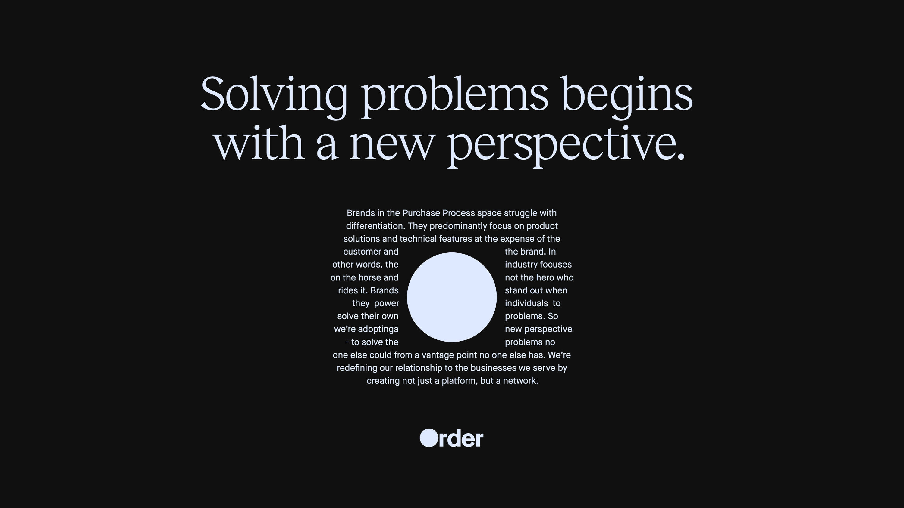
We worked with Negotiatus to rebrand as Order — a tool that works in-stride with businesses to streamline the experience of juggling vendors, workflows, software, and purchasing processes. Developing the name, logo, identity system, illustration style, photography style, and web design, GrandArmy helped position Order as the trusted partner of finance, operations, and procurement teams everywhere.
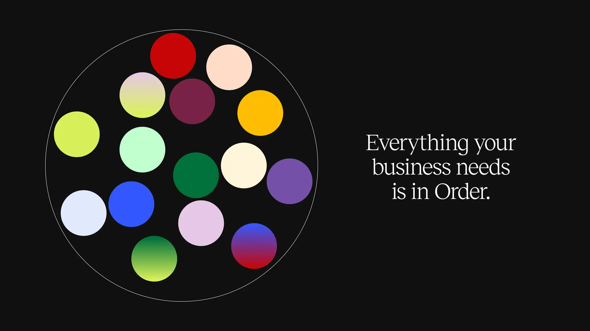
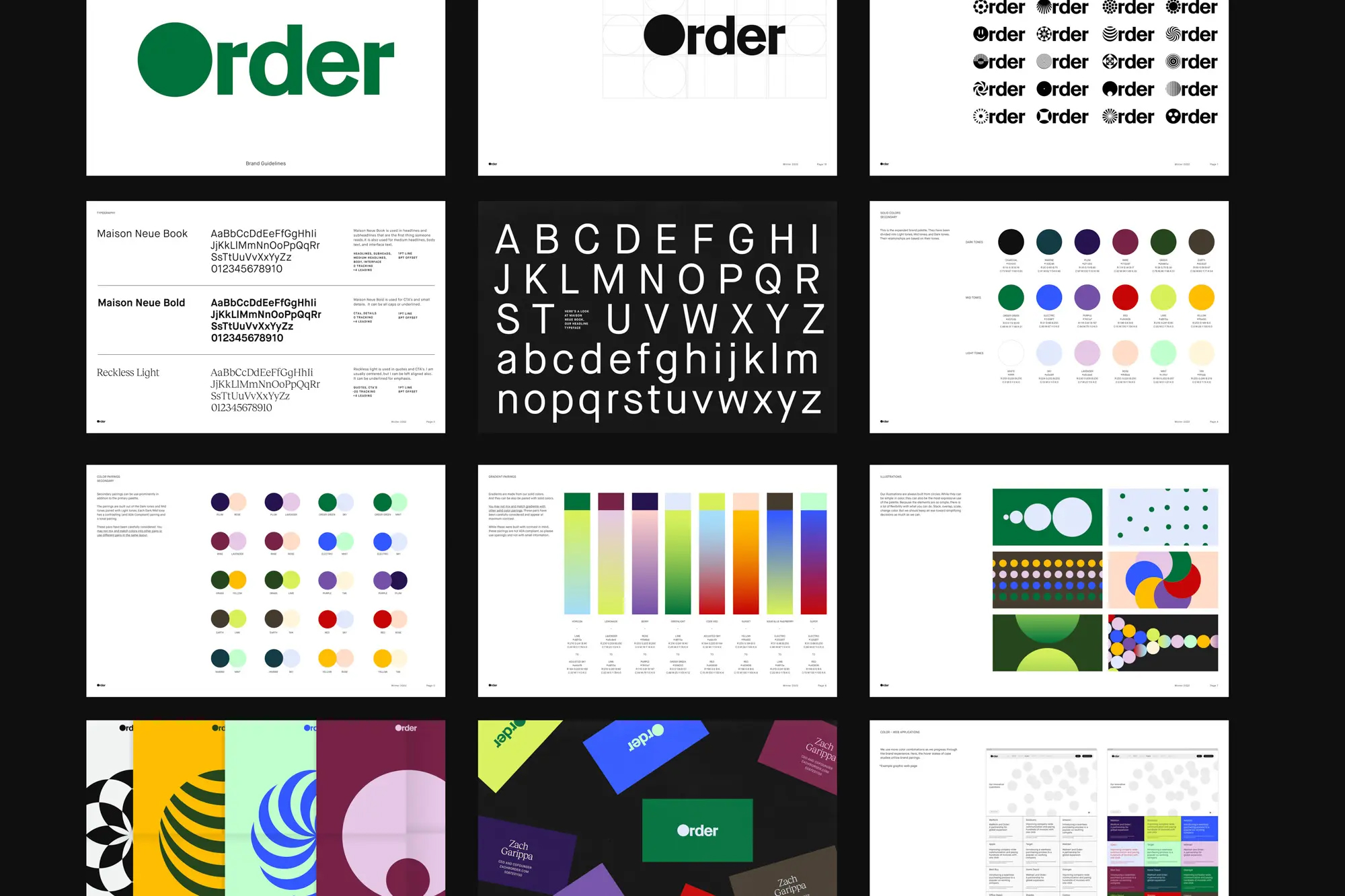
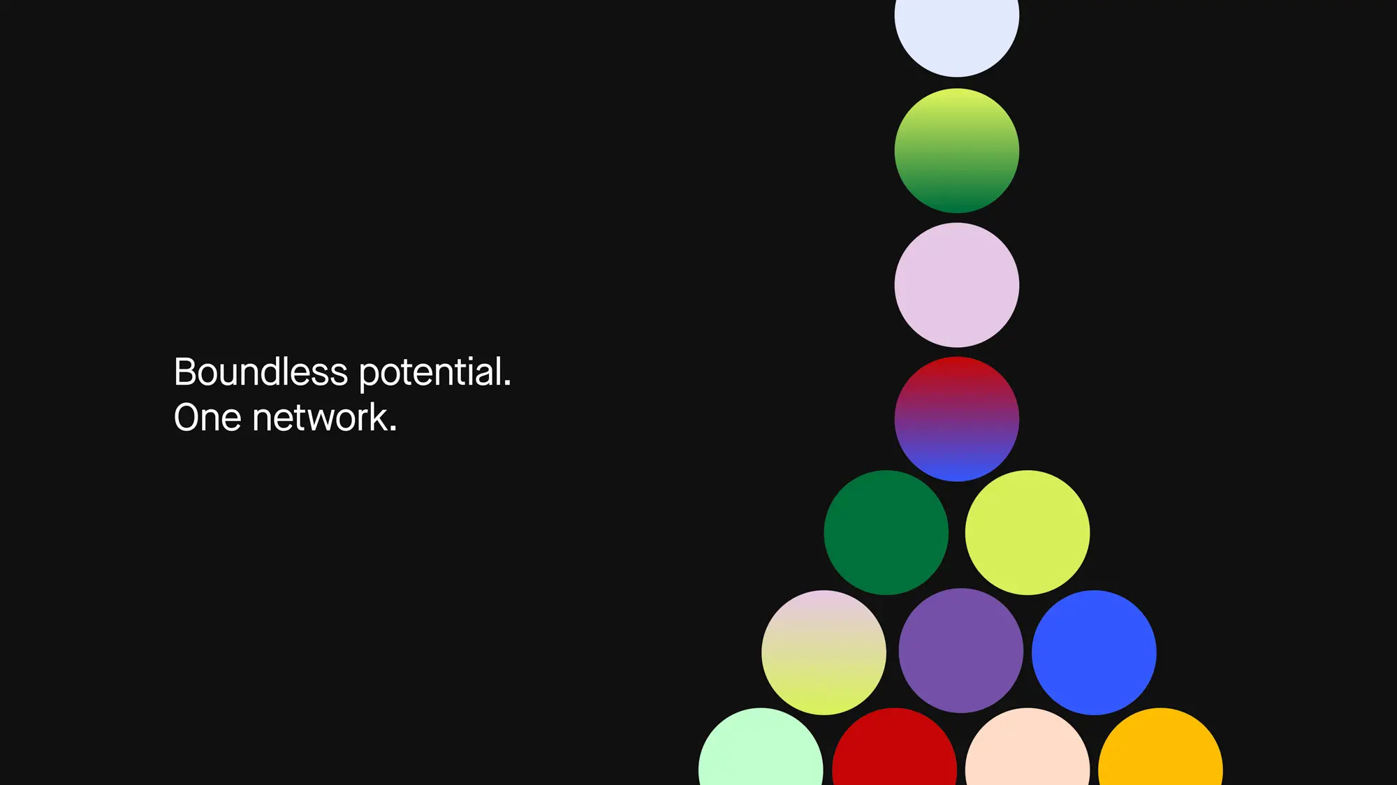
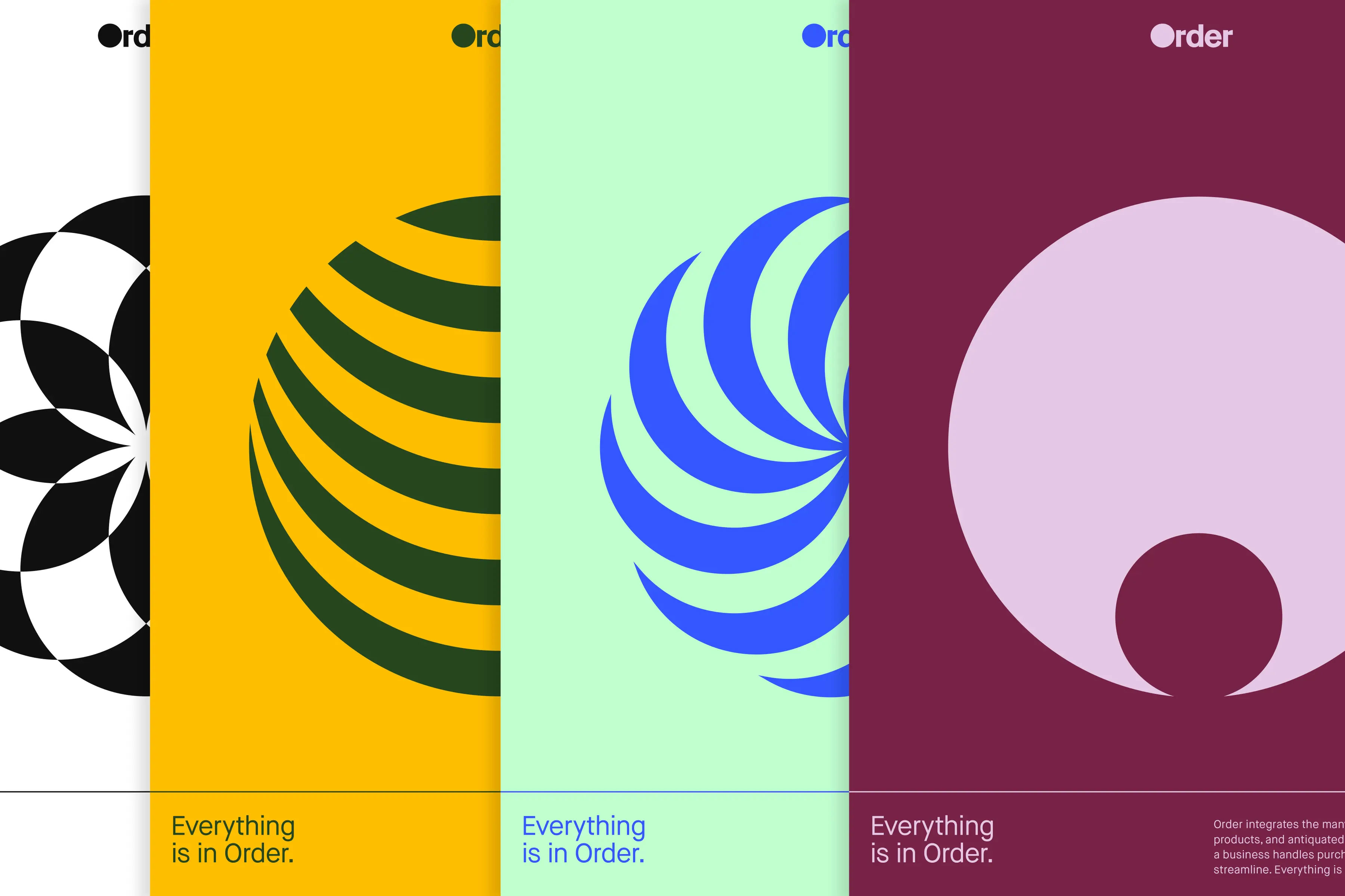
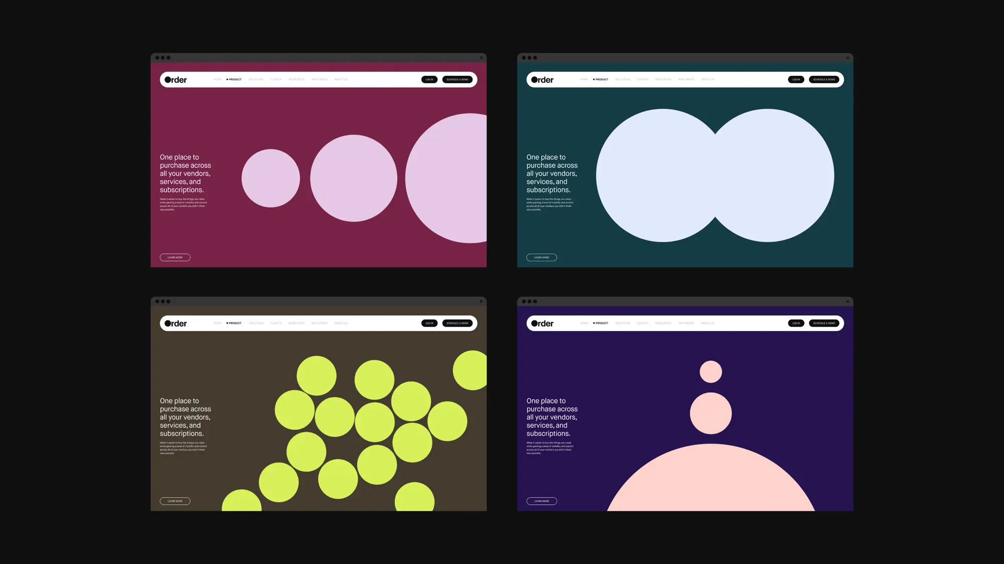
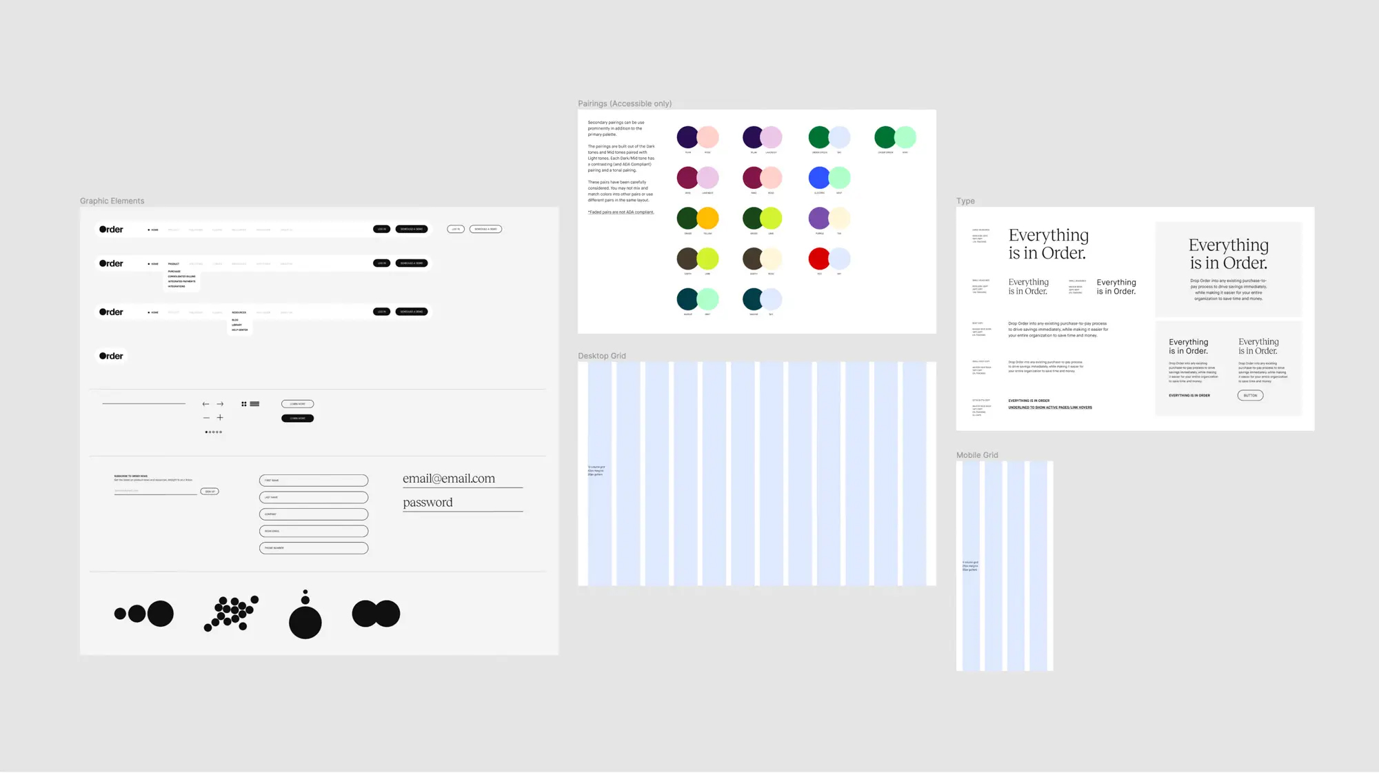
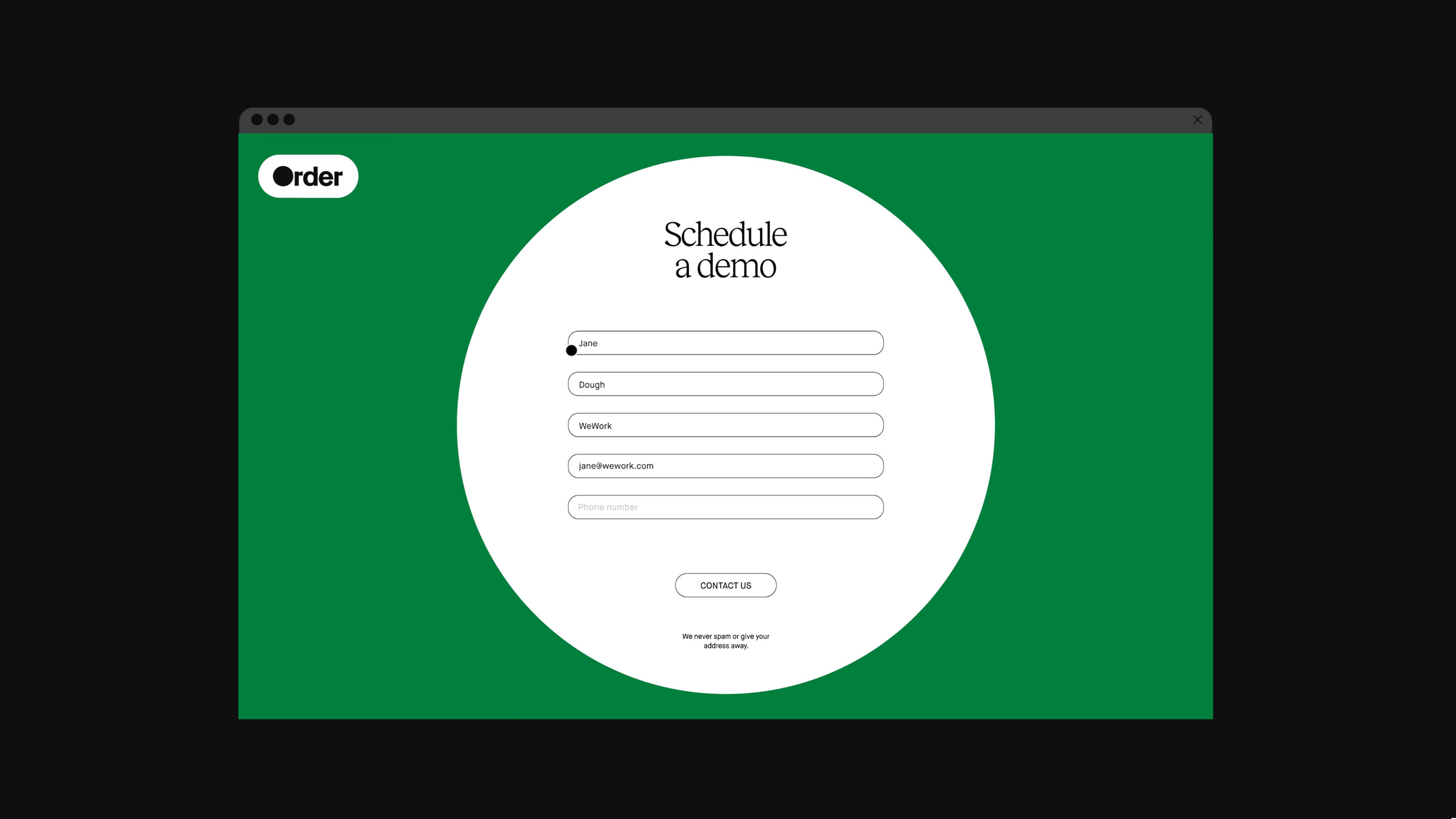
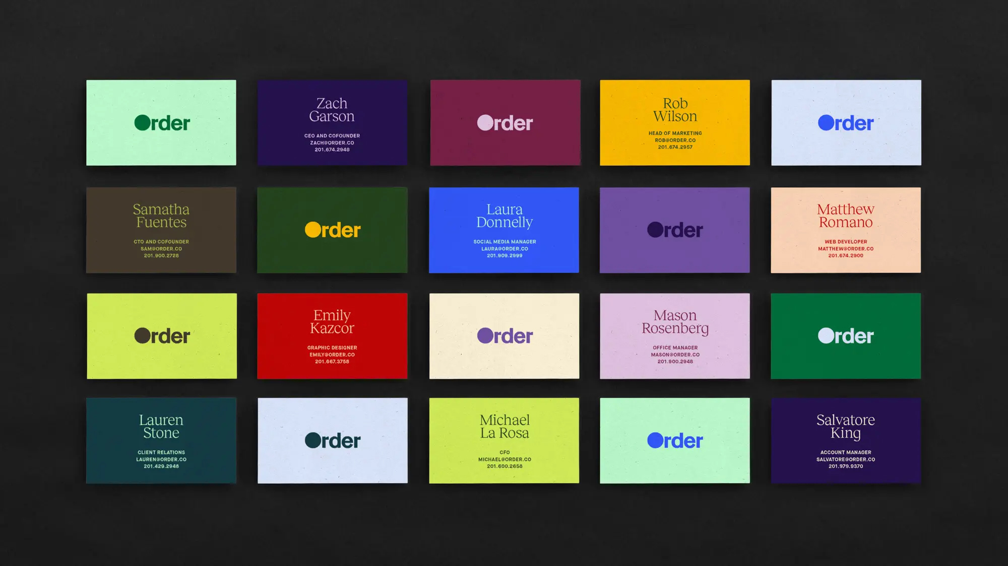
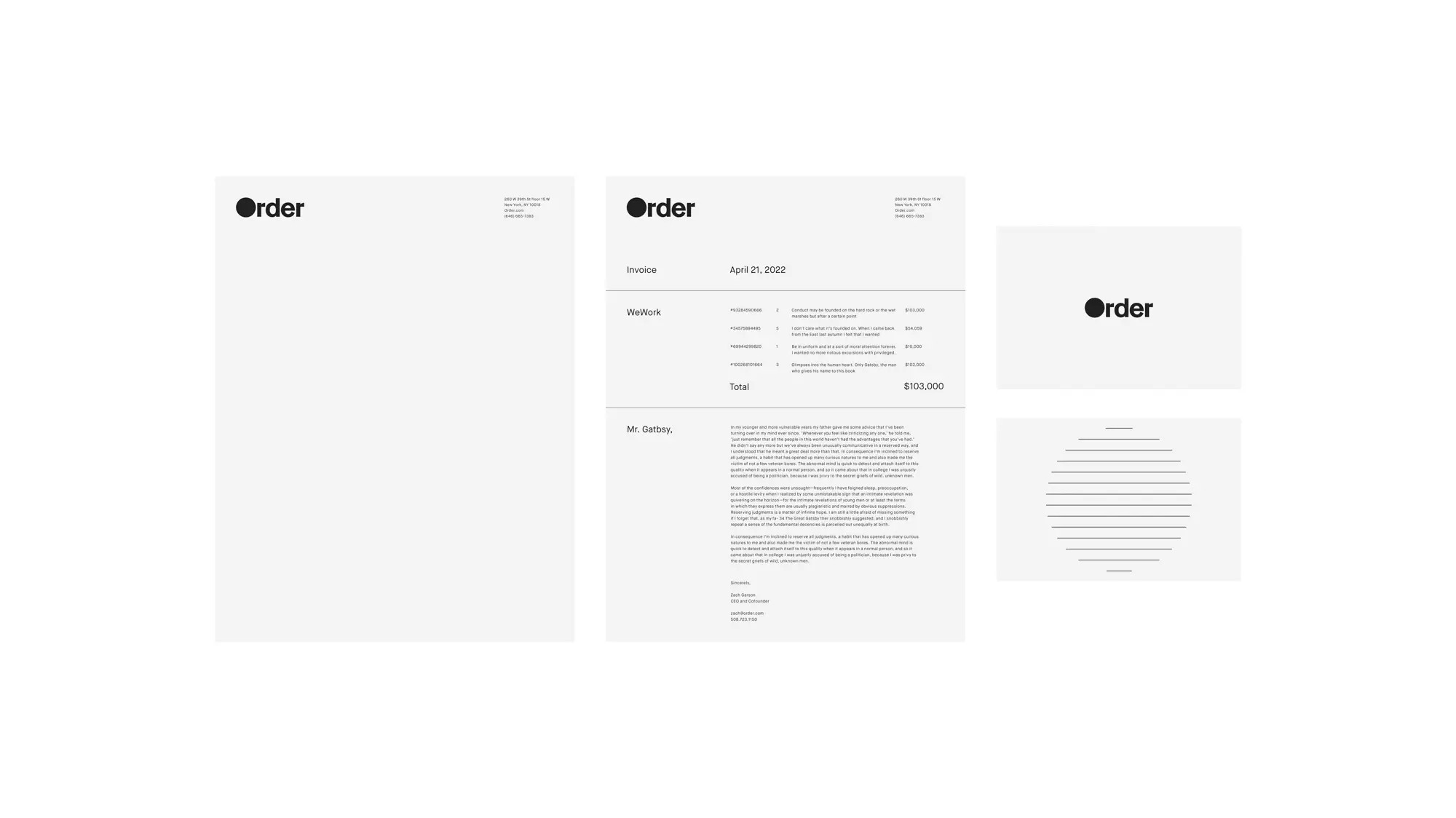
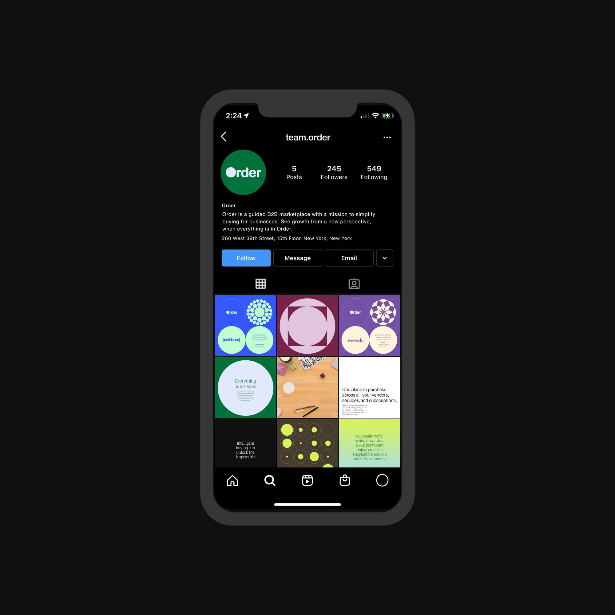
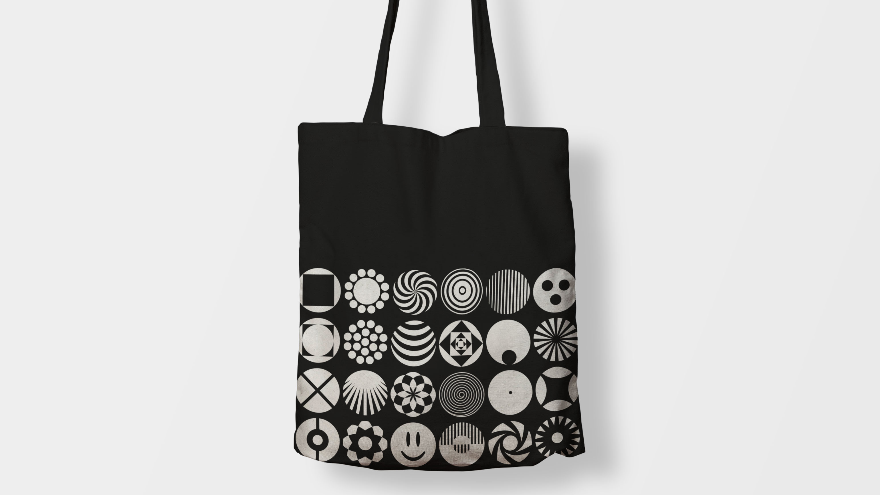
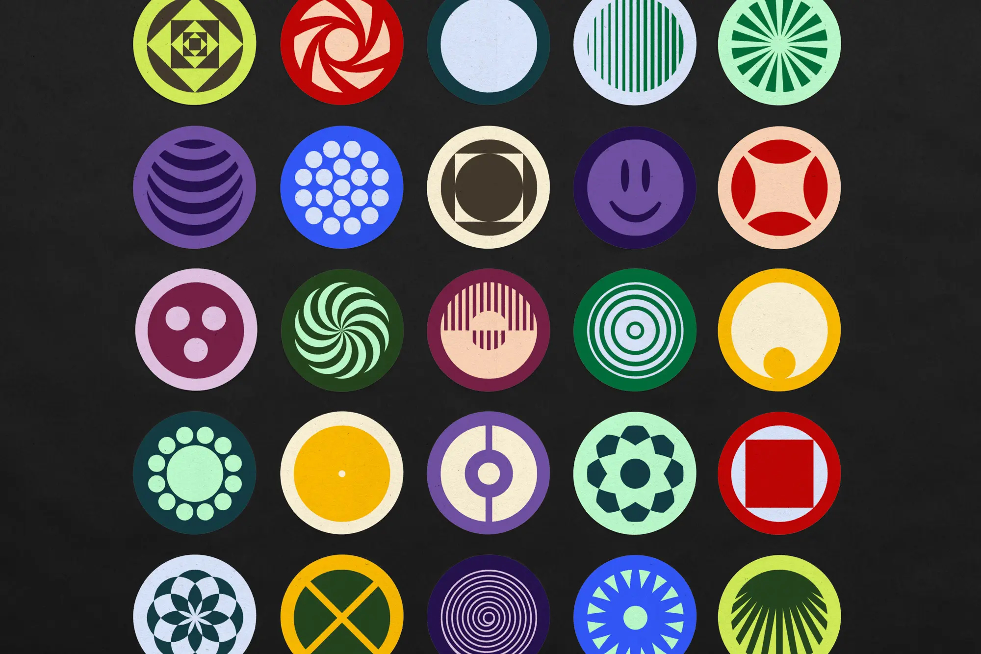
The identity is anchored by a filled circle “O” in the Order logotype. The “O” becomes a container and an organizing device that can represent products, services, and the values of the brand. The simplicity of the circle paired with the versatility in its expression serves as a metaphor for Order’s powerful, flexible, and simple software.
The identity is anchored by a filled circle “O” in the Order logotype. The “O” becomes a container and an organizing device that can represent products, services, and the values of the brand. The simplicity of the circle paired with the versatility in its expression serves as a metaphor for Order’s powerful, flexible, and simple software.
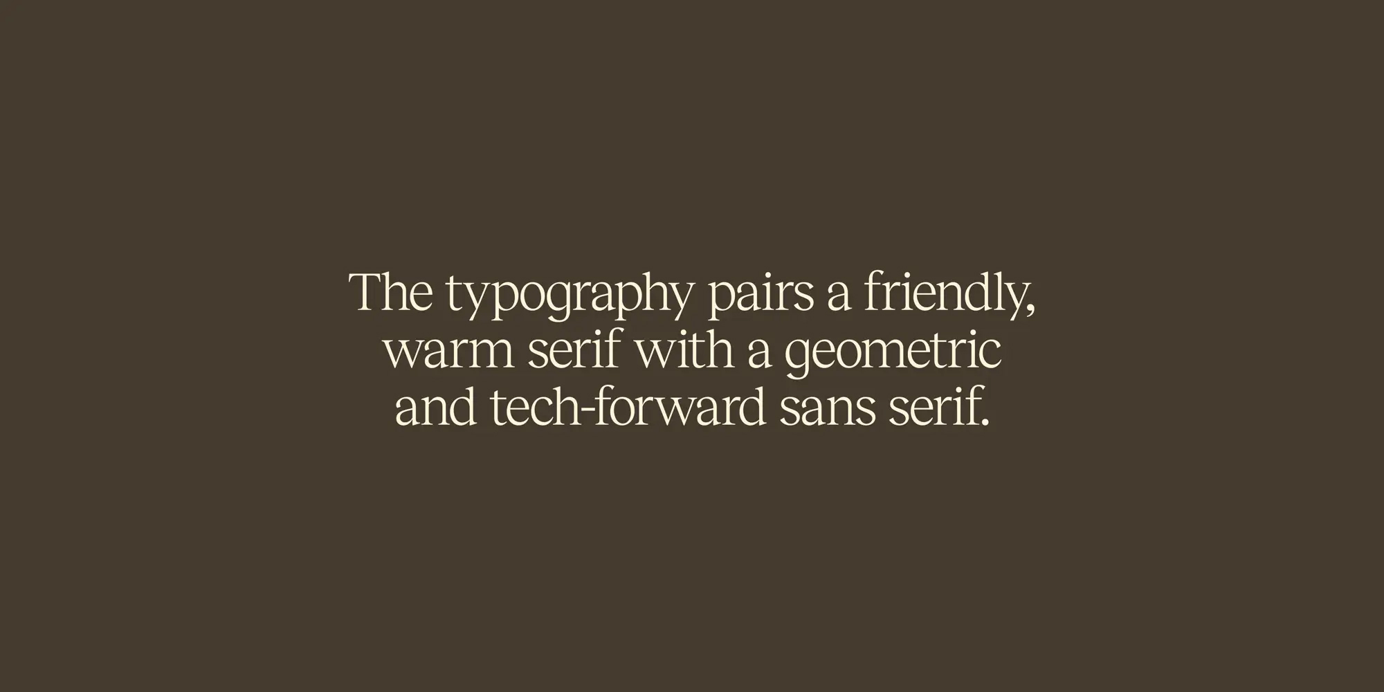
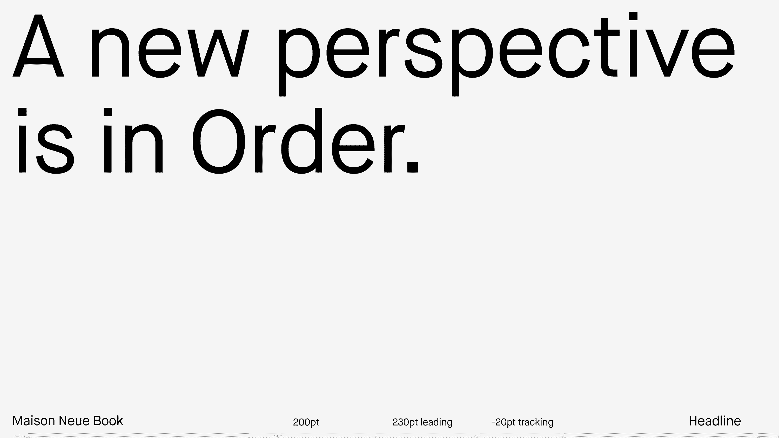
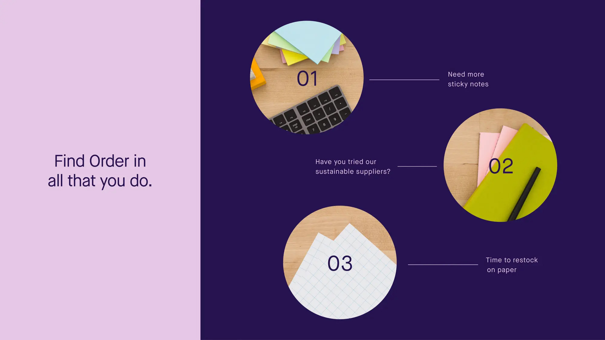
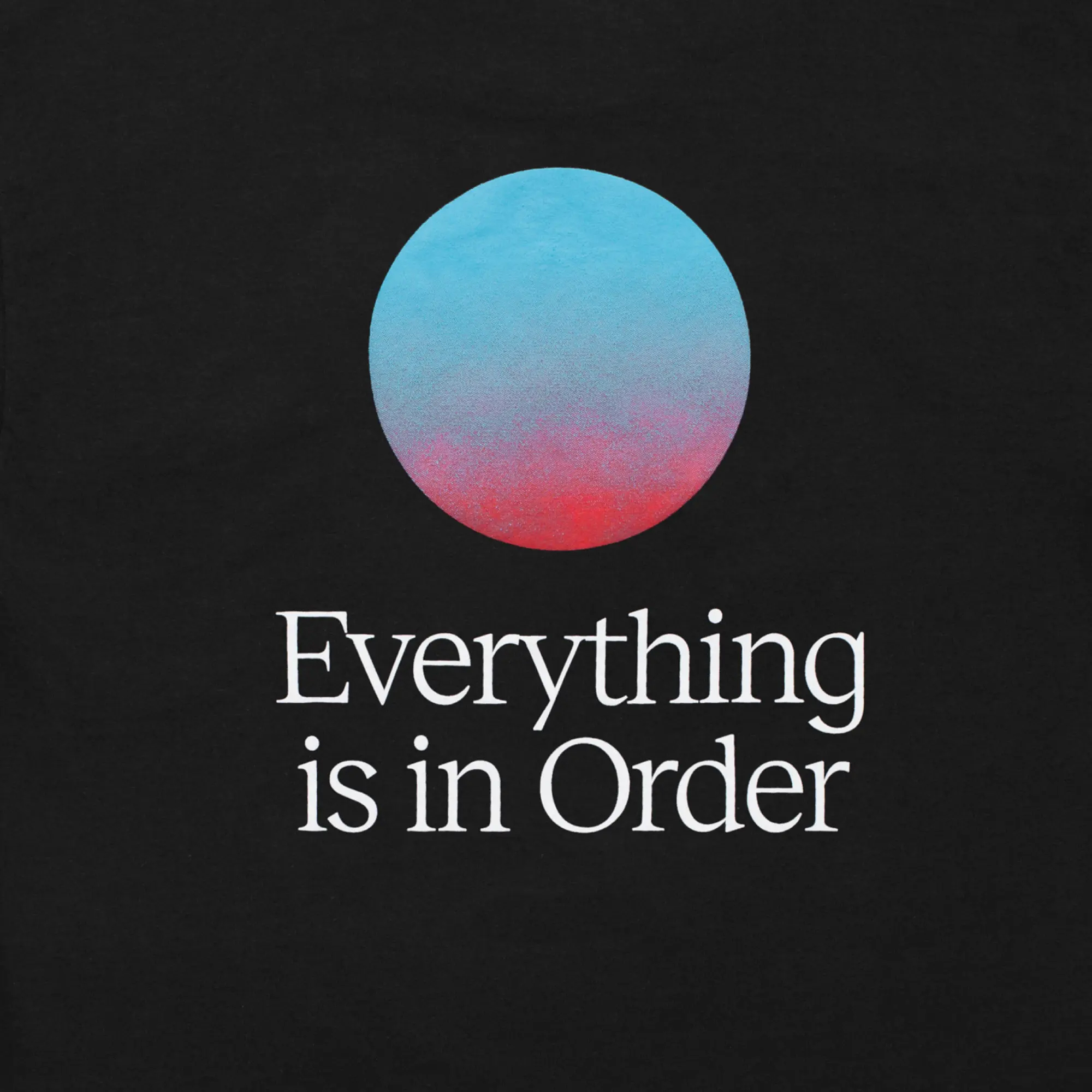
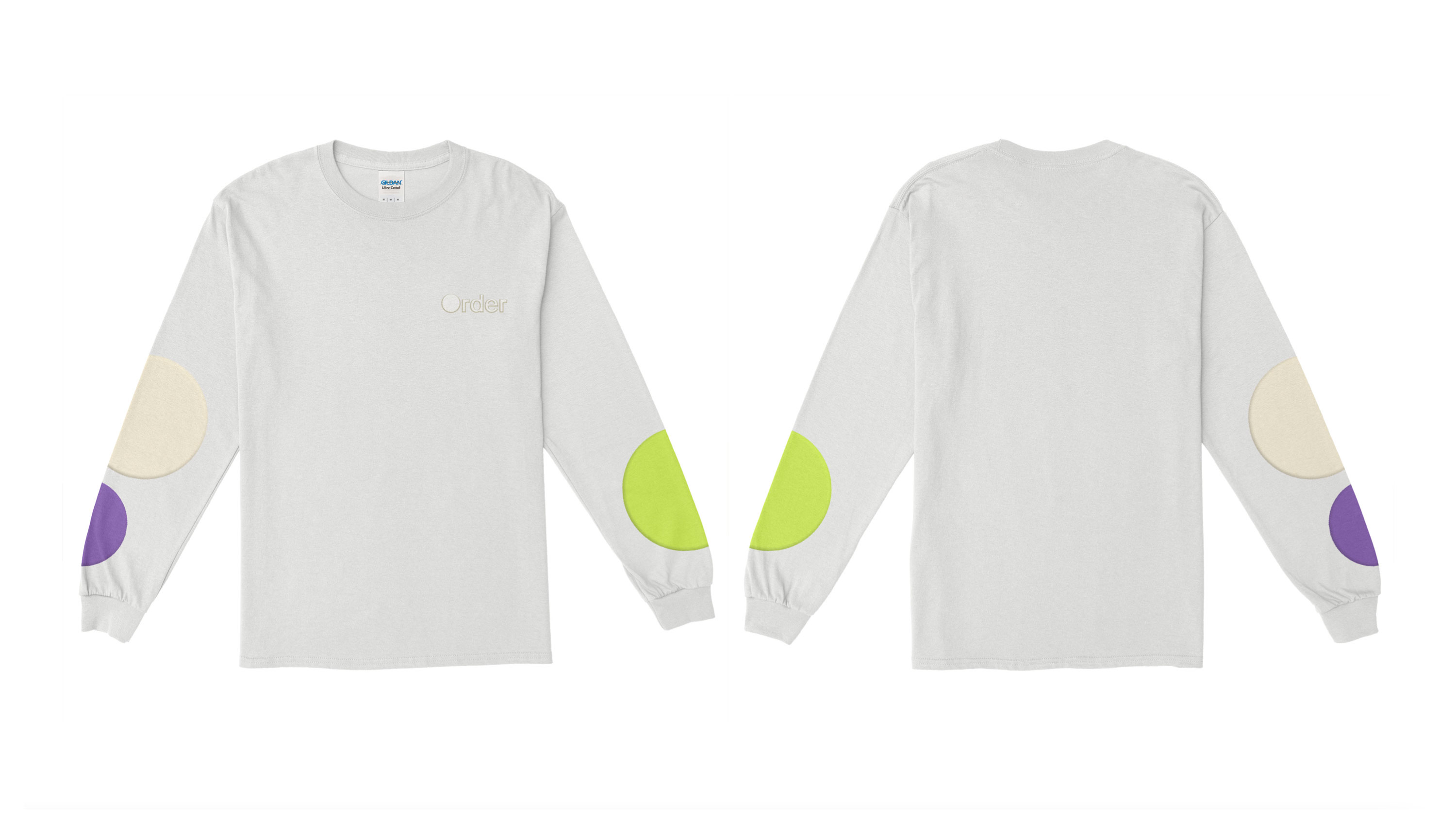
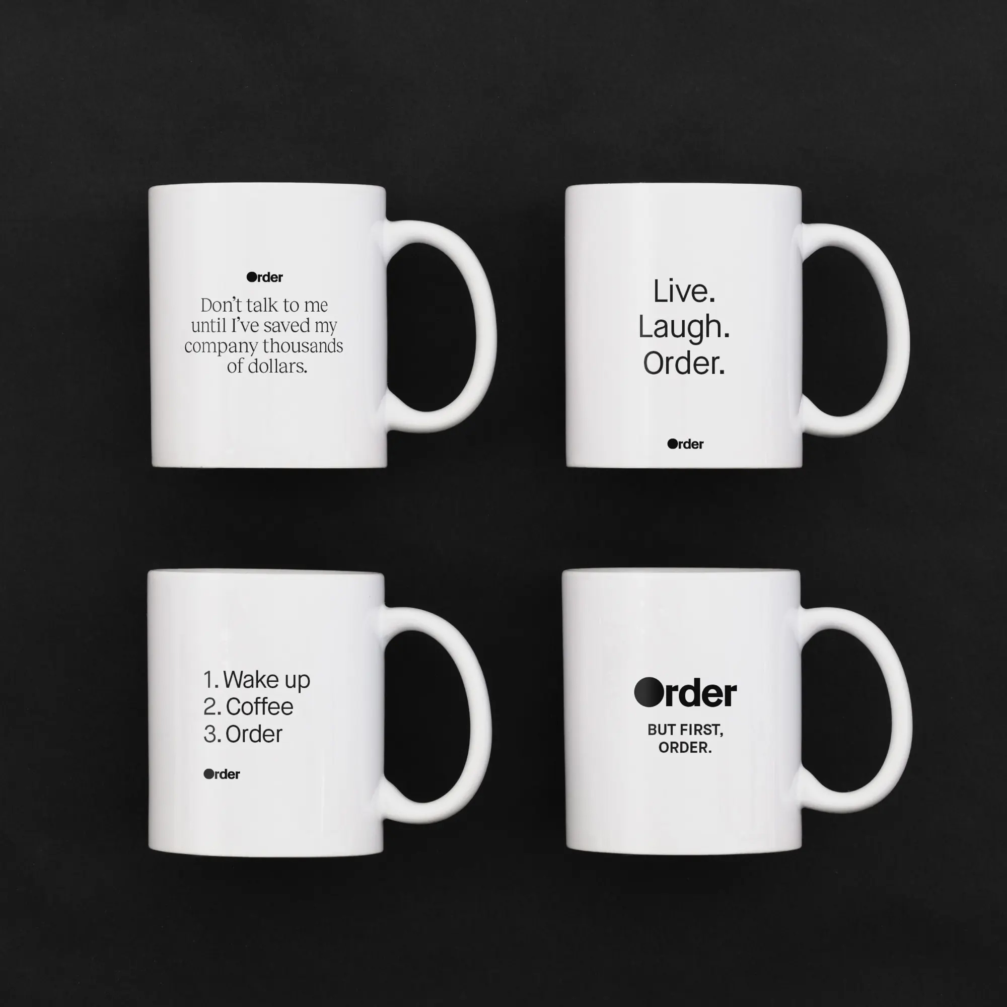
The circular forms are paired with a sophisticated color palette and warm, tech-forward typography to evoke the calm and organized feeling that Order provides its customers..
Full animated case study.
Creative Direction: Michael Stone + Joey Ellis
Copywriting: Michael Stone
Design: Kayla Donlin, tristan dubin, hyunjin kim
Photography: Jack NesbitT
Full animated case study.
Creative Direction: Michael Stone + Joey Ellis
Copywriting: Michael Stone
Design: Kayla Donlin, tristan dubin, hyunjin kim
Photography: Jack NesbitT